GSatTrack to Tableau: Getting More out of Reports
Data Visualization: GSatTrack and Tableau
In the Remote Data Ecosystems Series, we discussed the idea that data operations involve gathering, moving, transforming, and delivering. In the final article, we mentioned the multitudinous options available for delivering data, displaying data, and working with it in a UI. Tableau is one of those many options, and whether you use GSatTrack's API to get your data into Tableau or not, you can also use the GSatTrack portal to run reports and export data that can be visualized in Tableau as well. Our own data scientists wanted to provide an example of that with a short walk through.
GSatTrack Offers Powerful Reports
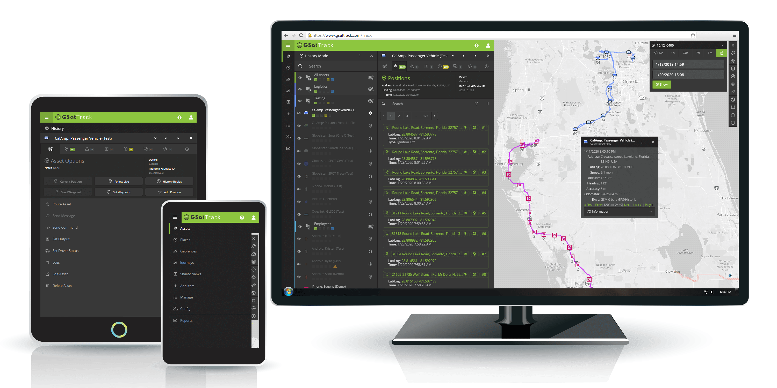
GSatTrack stands as a cutting-edge, web-based solution that seamlessly integrates satellite and GSM tracking capabilities. Compatible with modern web browsers and operating on a multilingual platform, GSatTrack consolidates the positions of hundreds of products into a single unified interface. This innovative system empowers users to effortlessly display and manage asset locations and movements in real-time, offering insights into crucial data such as position, speed, altitude, and heading through continuous GPS updates. With GSatTrack, businesses gain access to a universal, hardware-agnostic, and cloud-based data visualization and management platform. This advanced solution enables managers to track, command, and control assets worldwide in near-real-time, fostering enhanced efficiency and decision-making.
Downloadable reports and data visualization play integral roles in the landscape of informed decision-making, presenting organizations with a multitude of benefits. These tools offer a profound comprehension of data, unveiling insights into patterns, trends, and anomalies that might otherwise go unnoticed. Rooted in evidence, reports and visualizations empower decision-makers to ground their choices in tangible data rather than intuition, thereby elevating the precision of decision-making. The ability to distill complex data into easily understandable formats is a hallmark of visualizations, fostering effective communication and consensus-building among stakeholders. By translating intricate information into accessible visuals, these tools become invaluable aids in shaping a shared understanding and facilitating more streamlined decision processes.
Downloading Reports
Reports provide Asset and Ecosystem Managers with powerful tools to visualize and export data in a more concise and actionable format than what Map Views and log lists can offer. These reports excel in synthesizing extensive data, transforming it into actionable insights that directly contribute to cost savings and efficiency measures. The flexibility of generating reports in both PDF and CSV formats enhances their usability, offering versatility in accessing and utilizing valuable information.
Types of Reports
Activity Report
Alert Summary Report
Asset Activation Report
Example: Fleet Trip Report
- Access the Report Menu
Log in to your GSatTrack account and navigate to the "Report" menu. -
Choose "Fleet Trip Report"
From the available report options, locate and select the "Fleet Trip Report" -
Select Specific Group(s) or Asset(s) and date
Choose the specific group(s) or asset(s) for which you want to generate the fuel consumption report. This helps in customizing the report based on your tracking needs.
Specify the date range for the report. This allows you to focus on fuel consumption data within a particular time frame, whether it's a specific week, month, or custom period. -
Run report
After selecting the specific parameters (group/asset, date range), click on the "Run Report" button. This will initiate the generation of the Fuel Consumption Report based on your specified criteria.
Interpreting and understanding the data in these reports.
Asset - The name of the asset whose report was generated
Trips - The Number of trips for the asset.
Uploading Data to Tableau
Tableau is a powerful and widely-used data visualization tool that plays a crucial role in transforming raw data into meaningful insights.Tableau enables users to create interactive and visually compelling dashboards, charts, and reports.
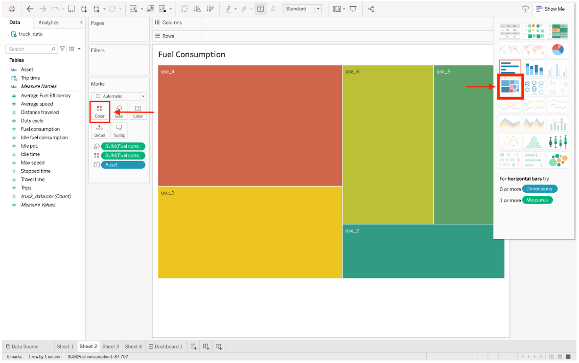
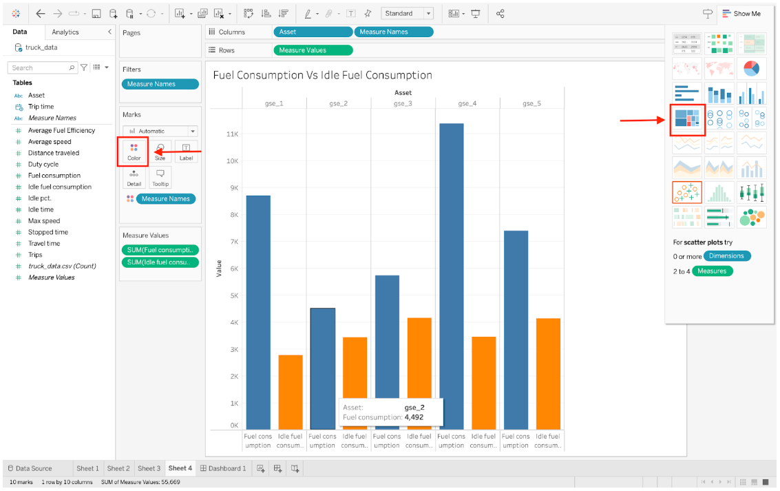
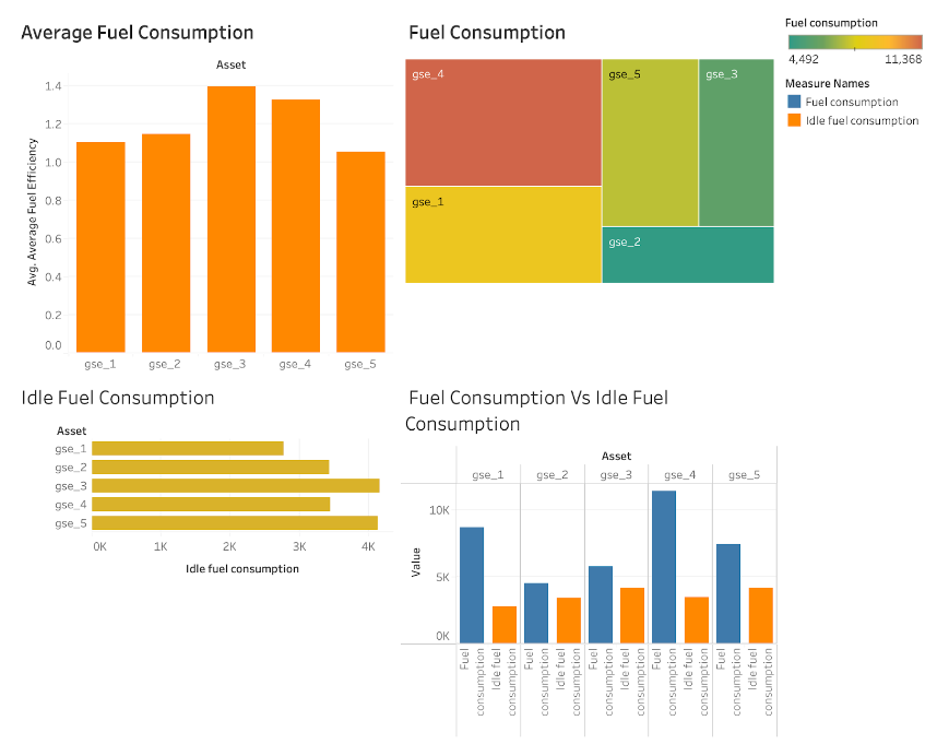
In Tableau begin by selecting 'Connect Data.' Then, choose the 'More' option and locate the report downloaded in the previous steps. Once the data fields are visible, proceed to create a new worksheet. In this version, let's start by visualizing the total fuel consumption per asset in the form of a treemap. Place the assets in the columns and fuel consumption in the rows. To enhance the visualization, you can customize the color in the 'Marks' menu.
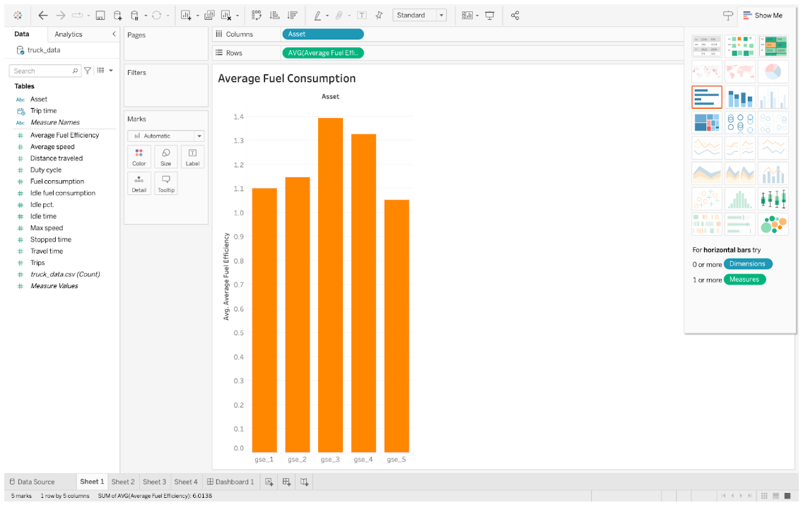
In the second example, where we analyze 'Average Fuel Efficiency,' arrange the worksheet with assets in the columns and utilize the 'AVG' function for the rows, representing the Average Fuel Efficiency.
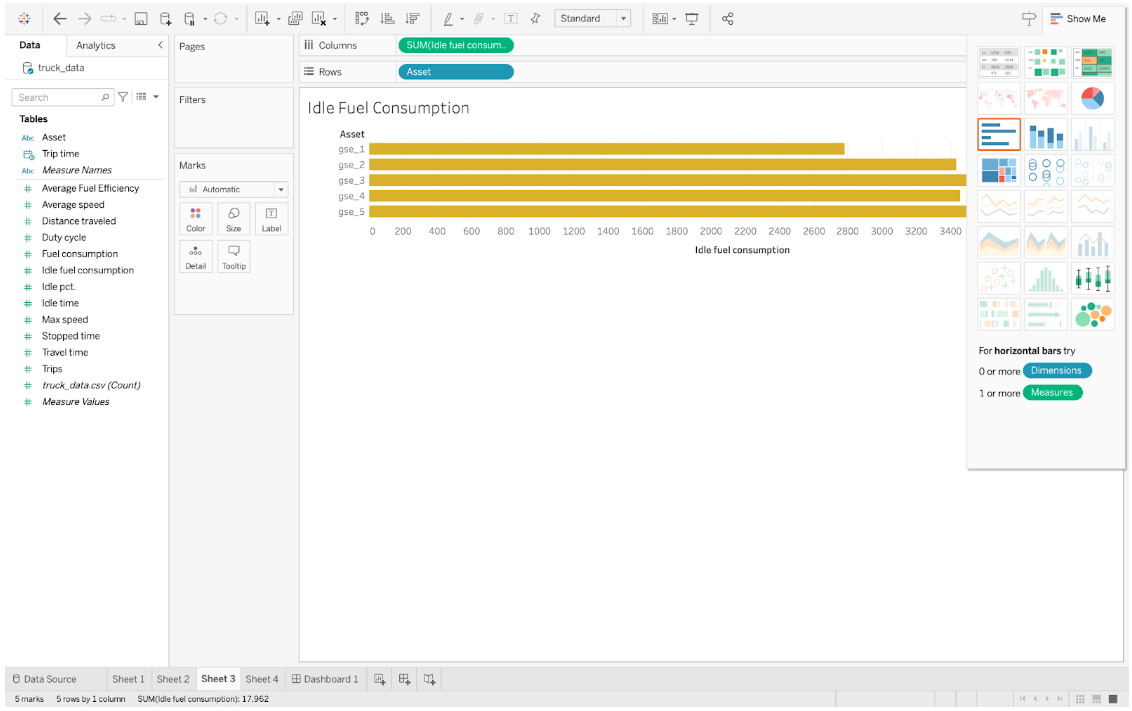
Moving on to the third example, focusing on 'Idle Fuel Consumption,' present the data using horizontal columns.
For the fourth example, comparing 'Idle Fuel Consumption versus Total Fuel Consumption,' include assets, fuel consumption, and idle fuel consumption. Opt for the 'side-by-side bars' option to visually compare these metrics.
Transitioning to the 'Dashboard' section, seamlessly integrate these created worksheets by dragging and dropping them into the dashboard."
We are using 2023.3.0 Version of tableau in this article , things can be a little different if your version is different.

